Jun 30, 2010

Simply Renee and The Bride (Me)


So - I got a phone call from a very lovely woman named Renee and she was SO nice to ask me to be a part of her Design Team at Simply Renee!  I am so excited as I have long admired their organizational products and I am in desperate need of them as I build my new craft space!  

Congrats to the other gals, I look forward to seeing all your work in the upcoming months.

In other news, I have a new tutorial up today on Altering Kraft Envelopes....click here to travel to my other blog.

Candy Shoppe Designs has another challenge this month and they gave us permission to do what we wanted!  I LOVE this challenge!  People have a chance to win a kit from Color Me Miki.  I created this layout using tons of fun supplies that I scavenged here and there all over my scrap room.  And the inspiration was my NEW Crop-a-Dile BIG BITE.  I first created the lace-up and then it could only suit one subject - a wedding!  I have rarely scrapped about my wedding day, so here goes The Bride.


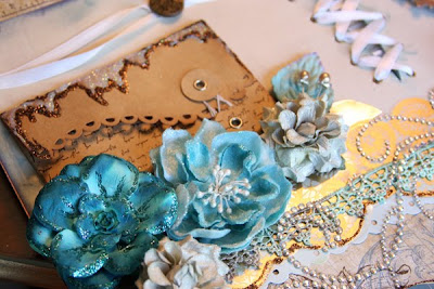
There is that lovely lace!


The lovely lace AGAIN and the Tattered Angels frames, a fave product of mine.


Bye for now - stay tuned for a tutorial based on this layout over at Color Combos Galore.

Jun 29, 2010

SCHOOL IS OUT!

Today was the last day of school for my kids and before we head out to Dairy Queen to celebrate, I thought I would show these journals that I made for the teachers.  These were made with spiral bound note books I found at HomeSense.  I painted around the edges and applied paper scraps.  I love using this & that supplies to make things come together.  For the left one, I used My Mind's Eye paper and American Crafts letters, a BIG Prima flower and some Maya Road Ribbon.  The journal in the middle is Webster's Pages paper, Prima felt, and pearl stud, American Crafts letters, and Stickles.  The journal on the right was made with Kaisercraft paper, and Webster's Pages paper, Prima Felt, and a Silhouette cut victorian chair.


And here are their Teacher's Cards.  The stamps are Making the Grade from Cornish Heritage Farms.


Have a great day!

Jun 27, 2010

Getting Messy - Falling Back Into OLD Habits!

I can't seem to self edit!!!  I know there is a lot going on here - and I couldn't stop myself!  I have a goal this year to create more GUYish layouts. My sons and husband feel a little left out of my scrapbooking just because I am drawn to PINK and FLOWERS.  This layout was created using colors from Palette #12 over at The Color Room.


I really fell in love with this picture for inspiration, although I think I want to take a second stab at it to make an elegant layout, that will match its beauty.  For now though, we have GRUNGE - my old habits of apply way too much ink and distressing.


I loved making these flowers (die cut from the Silhouette).  The paper is Basic Grey.  The GOOD letters are Pink Paislee, and the REALLY is American Crafts.


I adore these Tattered Angels frames - the package comes with so many that I can keep using them on layouts for a good year!  I applied Glimmer Mist, then Distress Ink (Mustard Seed).  The orange ink is Spiced Marmalade Distress Ink with drops of Glimmer Mist applied to make those blots.  The M & S are stamped letters.


Here is another flower, this time, combining in some of that gold paper!  Stickles add a little sparkle to them.


I do hope you'll head on over to either Color Combos Galore or The Color Room to play with awesome color combinations that will stretch your creativity.  I am just loving my new found appreciation for pre-determined color palettes!

Jun 25, 2010

BELIEVE in Fairy Tales - Color Combos Galore

Before I begin, I have some AWESOME news to share!  I have been playing at Color Combos Galore NING site for the past month and have been loving the color palettes and challenging myself to use color combinations that would not come naturally to me.  AND since I have been playing along, I got a nice pat on the back and was asked to become part of their amazing Design Team!  I am beyond excited to be a part of it!

Yesterday, a new color palette (#148) was revealed and here is my take:


I took some light blue stickles and dressed up the photo a bit to make it more fairy tale like.  Nothing screams fairy tales like SPARKLES!   I stamped the "Once upon a time" stamp from a CHF stamp set that I had designed a couple years ago.  That scallop is Cappella from Basic Grey.


I wanted to keep with the theme of fairy tales and PRINT, so I stamped some script on the lavender cardstock (Unity Stamp Co), and some Vintage Text from CHF on the BELIEVE.  Those cute brads are from The Paper Studio - aren't they adorable?  The flowers are an older set from PRIMA, and I applied some stickles to the leaves.


YEARS ago, I bought some hinges at Lee Valley for projects, and I never used them.  This project called for hinges!  I wanted to create that book feeling even more, so applied this HEAVY hinge, and applied some gold stickles for a nice whimsical effect.


Thanks for stopping by and have a GREAT weekend!

Jun 20, 2010

Happy Father's Day and The Color Room

First things first, Happy Father's Day to all the dads out there!  We had a nice day coffee and presents, then church, and then a BIG lunch with the kids and their Dad.  The kids were so well behaved and we thanked them dearly for getting along.  Even baby William was peacefully awake and quiet for the whole time we were out.

Here are a 2 cards I made for both my Dad and Mark's Dad.  It was a last minute card with 7 Gypsies tags, a retired stamp from CHF and some Webster's Pages paper.  EASY as pie!  And to make 2 identical cards is the way to go.


And here is my first layout for The Color Room challenge NING site.  I used their Palette #11 and sketch for the following layout IMAGINE - PLAY.


I had some fun with layering on this layout, and USING UP OLD STASH.  I am really enjoying participating in color challenges because of the methodology of putting a layout together.  I go around my craft room just pulling colors out - doesn't matter what it is, then I somehow make it work on the page.

I brought the word imagine a while back at Michael's and finally found the perfect picture for it!  I treated it with pink paint, then applied stickles, then because I didn't like the result, I applied Dazzling Diamonds glitter by Stampin' Up!


I thought I would take a picture showing all the layers here....we've got Queen & Co felt, circles of paper, a die cut paper layout, a strip of lace paper, and a chipboard tree from Basic Grey, flowers, and the chipboard imagine.


I printed out my journaling onto photo paper and hand cut all the letters and pieced them back together on the paper.


A little while back, I won some Unity stamps, so here they are in use (the circles and the EVERYDAY LIFE sentiment).  That cute crown is a brad from the Paper Studio.  The letters are My Mind's Eye, the brackets are Basic Grey, and the film strip is an old rub-on from Daisy d's.  And there is some paint there too.


If you like the color palette and can play along with The Color Room, you have until June 25th to upload to the gallery.

Bye for now!

Jun 18, 2010

Color Combos Galore - ME - FEATURED - How About That?

I am excited to share with you the newest Color Combo #147 from Color Combos Galore, a challenge NING site that has a very talented design team and members!  I was asked if I could create a layout for this week's color challenge as a featured member.  OF COURSE I would!  I would never turn down a challenge and a chance to be in the spotlight.

So here is the color combo with a designer challenge:


And here is my take on my daughter's art & table:


A while back, I won a February 2010 kit from Up the Street Scrapbooking, and this layout was made with the kit papers and embellishments - lots of yummy Basic Grey and Maya Road.  This shipping tag tucks into the envelope nicely.  I had to trim it a bit.


I think I need more of these Maya Road envelopes!  They are quite fun to dress up and stamp!


More Maya Road flowers, Prima Leaves, K & Co Metal (imagine), Prima Letters, My Mind's Eye brad.


Have a great weekend!

Jun 15, 2010

CLAY BRADS - MAKE IT!

Just a quick note to let you know that my new CLAY BRAD tutorial is up on my other crafty blog.  Here is a sneak!

GOING SOFT

I am going soft girls!  I have been playing along at Color Combos Galore and have found the past 2 color palettes beautiful and soft.  This is Inspiration Palette #146.  Along with the color combo - there is also a challenge.  This week was to add some sort of stitching - so I added some FAUX stitching to the LOVE letters and rub-on stitches on the bottom of the layout.  I am SO sad that this paper is no longer available (Chatterbox Artsylicious Fine Lacquered Paper).  It is embossed, so you can apply paint, ink, whatever to the negative space and make the floral pattern pop.

My picture - I TRIED TO TAKE A PICTURE FROM A DIFFERENT PERSPECTIVE.  I love seeing these artistic pictures that I see other gals playing with, so I finally jumped in and had my daughter pose for pictures from the knees down.  She could not understand why I was doing this, and continued to make sure she was smiling - ADORABLE!  I played with photoshop actions to make the image POP and I used the dodge tool to lighten up her legs that were covered in bruises.  It worked like a charm!


Here is a shot of the new Pink Paislee frames that I got from my Up The Street Scrapbooking kit this month.  I sprayed it with Glimmer Mist (takes a while to dry!).


Here is a picture of the faux stitching on the letters, which were PLAIN Kaisercraft chipboard letters that I painted cream, then lilac.


If you want to play with this color palette too, go check out Color Combos Galore - you have until tomorrow to play, and of course, you can always just use the colors whenever you want.

Jun 13, 2010

Cute as a Cupcake - Candy Shoppe Designs Challenge - FREE GSD FILE

Candy Shoppe Designs has a PAPER CUPCAKE challenge going on right now, until tomorrow June 14th.  There is a paper cupcake making tutorial that you can watch and then make your own, however you want!  I chose to create a canvas piece of art for my daughter, therefore a FLAT paper cupcake.  BEST part is, this is a $2.00 canvas turned into a piece of art!

The winning entry will receive a kit from Color Me Miki (see blog candy below).


Here is my take on the challenge, using Turquoise and Garden Fairy Glimmer Mists for the background, my Cornish Heritage Farms Vintage Text Scrapblock (6x6 STAMP).  The paper is the new black and white line from My Mind's Eye.  I designed the title in Photoshop and used my Silhouette machine to cut them out.  If you want a FREE GSD FILE that says "cute as a cupcake", you can download it HERE.


I had some of this sheer material so I thought I would use it for icing, twisting in some We R Memory Keepers trim.  The ink I used is CHALK INK - Chestnut Brown for all the stamping and edging.


After I cut the title in black cardstock, I applied RANGER GLOSSY ACCENTS for a nice shine!


Again, I used my trusty Silhouette to cut the circles, then painted them with a RANGER dauber.


One of my favourite products lately is Maya Road's velvet ric rac ribbon (that nice rosy coloured one).  The crochet ribbon is PRIMA.

If you have time, try making your own cupcake creation for the CANDY!

Jun 12, 2010

Meeting Up With Scrappy Friends!

I think it is quite a blessing to be able to meet people on-line through this paper crafting world, and be able to meet in person from time to time and there is no awkwardness.

I was able to meet up with the ever talented Sherrie Siemens (below), who came to my hometown of Burlington to teach some Copic classes and Copic certification.  Sherrie and I had worked together for Cornish Heritage Farms.  And Jen, had also worked with us at CHF and she and I get together all the time to hang out and scrap.  As it happened, Sherrie happened to be meeting up with Kerry from Cards by Kerry who I never knew before last night and found that she lives in Burlington too!  I am always happy to meet a new local scrappy friend!  We had such a great time, lots of laughs and really really good conversation.


And for some CRAFTS, the ladies had noticed that I was wearing a necklace, and had asked if I made it!  This is it (above), I had made it for a Bead Trends call, but it never got picked up, so I decided to wear it...which is unusual for me.  I make jewelry, but don't actually wear it.  What's with that? 

Enjoy your Saturday!

Jun 10, 2010

Variated Petals - Playing with WHITE Flowers!

I just posted a QUICK tutorial on my other blog in case you're interested!  To alter this flower, it took me all of 5 minutes.


Happy Crafting!

His Story

Thanks to Tara at Up The Street Scrapbooking for putting together an awesome kit for June 2010!  Here is my first layout using MOST supplied from the kit.  We have some Webster's Pages, Maya Road envie, and Glimmer Mist, Paint, and Copic Markers!  Again, I was inspired to get my colours out for the COLOR ME HAPPY challenge going on at Scrap Your Crap.  I coloured some of the paper with Copic Markers (the books at the top, and the blue dots on the ball. Paint was used for the letters and envie, and Glimmer Mist was my medium of choice for the background shadows (PATINA is my FAVE Glimmer Mist colour).


This layout has inspired me to write out all of my children's birth stories.  They love to hear about how they were born, when and what they first did.  Before I forget, I plan to write down as much as I can remember from each birth, and tuck it into layouts for them to read later in life.

PS- if you haven't bought these yet, the KAISERCRAFT plain chipboard letters are awesome!  I picked them up from Scrapbook Star and you can see that I've been using them on ALL my recent layouts.  I just paint them to suit my layouts.

Jun 9, 2010

Give Life


PICTURE PERFECT SNAP SHOT!  Here is my little guy as he is TODAY with a party hat on (this is a warning to Mothers - never leave your baby alone with a 4 year old girl for more than 3 minutes!).  Imagine my horror to come back into the room to find my little guy crying with a PRINCESS party hat on.  Did I take it off immediately, NO, like any good scrapbooker, I went to get the camera of course!

Back to the fun world of paper crafting....

I truly believe that this is the most wonderful story, and it's only the beginning.  I created this layout starting with this picture that my sister took of me right before William was born.  She had this super fan blowing in my face, I felt like a SUPERMODEL.  It was her new toy, so I just went with it.  I distressed this layout beyond recognition, and I used colour combo 145 from COLOUR COMBOS GALORE.  They have a wonderful design team there that rocked these colours.  BEAUTIFUL.

Also, at Scrap Your Crap, they have monthly challenges, and June's challenge 54 is COLOR ME HAPPY.  Using paint, pencils, etc. to add colour to your layout.  I used Patina Blue Glimmer Mist for the background and other papers, Mustard Seed Distress Ink for the background paper, Ranger Paint for the letters.  I also sprayed those original WHITE flowers from PRIMA....Some of the stuff on this layout came from Up The Street Scrapbooking Kit Club (overlay, flowers, buttons, Pink Paislee frame).  If you're looking for a kit club, you should check out Tara's kits.


Happy Crafting!

Jun 8, 2010

2 Sketches 4 You - For the Bride!

I thought I would challenge myself and try something new!  I decided to stamp CHF's Vintage Text backgrounder and draw my own image - I know - earth shattering drawing!!!  :)


It is a cute simple dress that I painted with diluted alcohol ink by Ranger (red pepper).  Stickles made a nice sash, and a tiny Prima flower tops it all off.  I love the idea of the text showing through.

This card is based on a sketch from 2 Sketches 4 You.


Happy Stamping!